
Crypto Market Cycle? Leveraging On-Chain Data to Contextualize Key Market Trends
In this column, we leverage on-chain data on Bitcoin (BTC) and Ethereum (ETH), the two largest crypto assets, to evaluate where we are in the crypto market cycle. Specifically, we examine three key trends: geographical flows, positioning by investor type, and market sentiment.
Crypto is especially suitable for such explorations because all transactions are recorded pseudonymously in a public ledger (aka the blockchain). By combining blockchain transaction data with additional datasets, it is possible to infer critical market trends in a way that is not possible for more traditional asset classes.
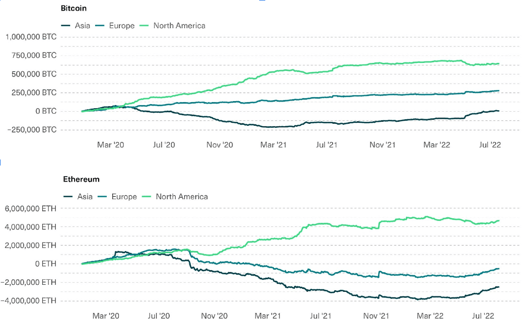
Geographical Flows: The Crypto Accumulation Trend by North American Entities—A Defining Trend of the Past Bull Market—Dipped and Stalled in Q2 2022
One amazing thing about on-chain data is that you can determine, to a reasonable degree, the geographical source of buying and selling pressure in crypto. By crossing blockchain transaction data, known addresses belonging to specific crypto entities, and web traffic flows, one can estimate which countries or regions are sending and receiving assets.
A defining trend of the crypto bull market over the past couple of years has been the accumulation of crypto by North American (mainly U.S.) entities, with outflows coming from the Asian markets. According to Chainalysis’ data, between January 1, 2020 and November 9, 2021, when the crypto market reached its all-time high, the net flow into North American entities was north of 645,000 BTC and 4.5 million ETH, over 3% of the total outstanding supply of each asset.
However, as the chart below shows, this trend has not only tapered off since then but also slightly reversed during last quarter’s crypto crash. Since May, when the market deterioration became more acute, the cumulative net flow into North American entities decreased by as much as 9.6% and 9.9% for BTC and ETH respectively, while the same metric for Asian and European entities was by and large on the rise. This is consistent with evidence from key players: Just two days ago, Coinbase, the leading North American crypto exchange, reported that a majority of Q2 trading volume took place in offshore exchanges, while the share of total crypto market capitalization held on its platform dipped from 11.2% in Q1 to 9.9% in Q2.
how can we help you?
Stay in the know
Stay abreast of the latest news, insights, and trends in crypto.
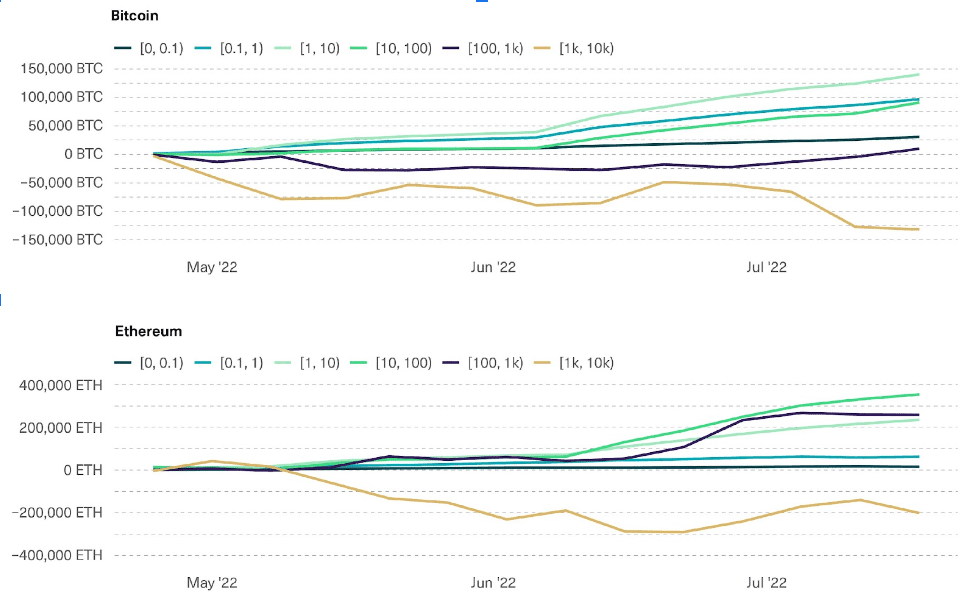
Positioning by Investor Type: Outflows From Larger Entities, Inflows Into Smaller OnesAnother way to slice and dice blockchain data is to cluster it into entities by the size of their crypto holdings.
Zooming in on entities with relatively low turnovers (to capture “investors” vs. “traders”), we can see the accumulated flows into entities that hold between 0 and 0.1 BTC or ETH, between 0.1 and 1, and so on. In this section, we’ll be focusing on entities that have a relatively low turnover, which are more likely to be investors instead of traders, and will exclude the entities with extremely large holdings, which are more likely to be exchanges.
As crypto prices started to tank more sharply in May, larger entities have been registering outflows while relatively smaller entities have been seeing inflows. The trend is stronger for BTC than for ETH: Since May, smaller investors have accumulated about 2% of the total BTC supply but less than 0.5% of the total ETH supply.
This trend also marks a pause from the crypto bull market of the last two years, in which larger entities drove the lion’s share of crypto accumulation. The fact that this trend has been stronger for BTC than for ETH confirms our perception that the latter has been gaining traction in larger investors’ minds, as excitement around the upcoming upgrade and ethereum’s roadmap continues to build.
Outflows From Exchanges and Other Larger Entities Into Smaller Entities
Market Sentiment: Implied Unrealized Losses Suggest the Worst Is Behind Us
The third and final analysis to consider is implied unrealized profit, or the current profit or loss of every held position, in entities that hold Bitcoin or Ethereum.
This metric has historically been most useful as a contrarian indicator: The higher the percentage of holders sitting on unrealized losses, the more likely the market is close to capitulation, and therefore the more favorable the timing for potential buyers is. As the old stock market proverb goes: “Buy at the roar of cannons and sell at the sound of trumpets.”
The chart below shows the percentage of the total BTC and ETH supply that sits on an unrealized loss, broken down by the loss size (between 0 and -5%, between -5% and -25%, and so on).
The percentage of the supply currently in losses stands at a tad below 50% for BTC and at over 60% for ETH. Perhaps even more striking, the entities that are currently sitting on losses of over 50% currently comprise over 40% for both BTC and ETH.
Since 2017, such levels were seen only during the March 2020 COVID crash, the 2019 correction, and the worst parts of the 2018 crypto winter. Although further demand shocks cannot be ruled out, the historical record suggests when investor sentiment is this negative, reversals can happen relatively quickly.
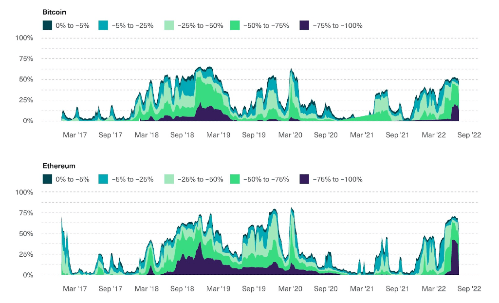
The Percentage of Supply Currently in the Red Has Parallels Only to the 2018 Crypto Winter and the COVID Crisis
Conclusion
It is worth noting that on-chain data is not perfect. Geographical flows can be estimated only for entities that are known to be based in a specific location, and are based on web traffic data, which might not reflect actual transaction volume accurately. Positioning by investor type cannot be detected for entities that don’t touch the blockchain directly, and no blockchain analytics company fully describes the behaviour of all entities that hold crypto assets. On top of that, market sentiment indicators make assumptions about each holder’s cost basis that might not be fully accurate.
Having said that, we think this data can provide key context in understanding where crypto markets sit. The key trends highlighted (geographical flows, changes in investor position by size, and market sentiment) suggests that dips in accumulation appetite by larger investors, mostly North America-based, likely were influential in the Q2 crypto market crash. On top of that, if the historical record is any guide, market sentiment has rarely been this negative. None of these trends seem structural or new, which suggests an appealing setup for long-term holders.